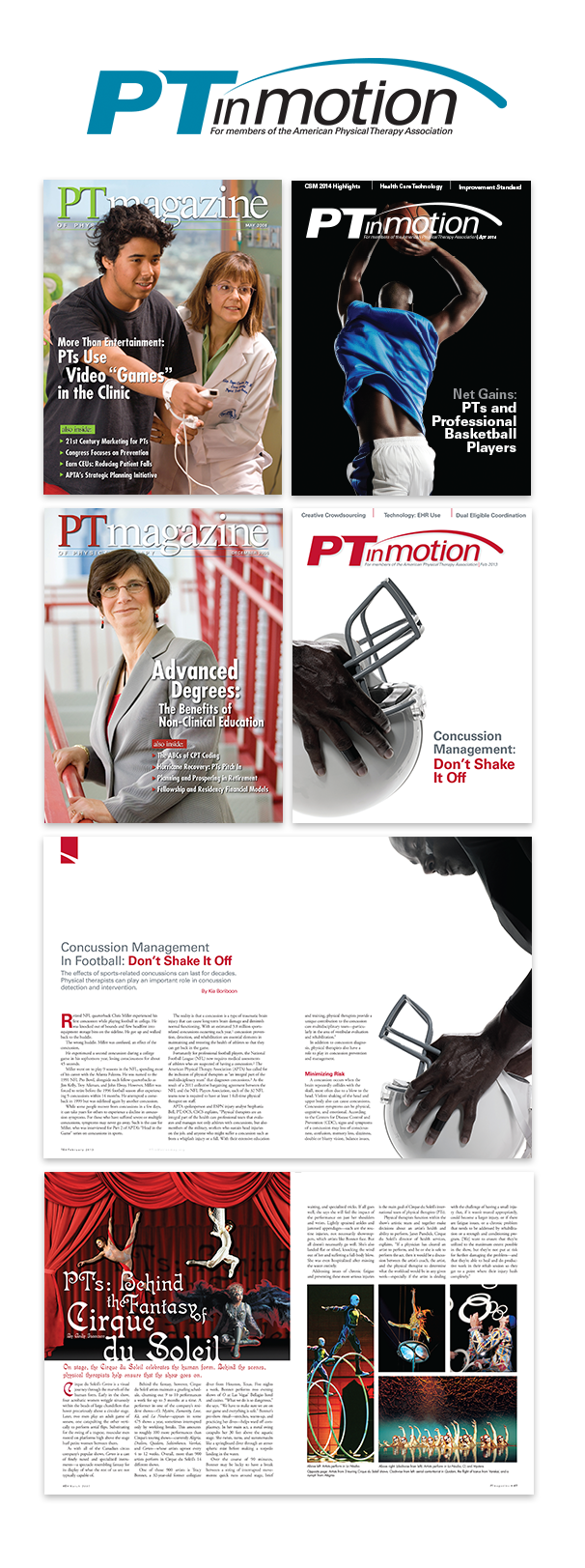
PTmagazine/PTinMotion
Rebranding, Redesign
PTmagazine was rebranded to PTinMotion to create a new, and modern appeal to attract
a new professional readership.
The new PTinMotion logo was created to
have modern lines and a fluidity of motion.
The layout of the magazine was also updated to add more white space to allow the copy
to breathe. Each specific column/article was assigned a header color which also appeared in the table of contents. This enabled readers to find a specific column easily from month to month. The feature articles were designated with colored markers on the top left page within the article, also coinciding with a specific color in the table of contents which helped differentiate the features from the columns and to help the reader identify
the article.
^ TOP

about me
I am a designer from the Washington DC Metro area with 13+ years of design experience. A 39+ year lover of black T-shirts, 25+ year lover of snowboarding,
and a 13+ year lover of racing my Mini Cooper S. I try
to get out to the mountain and to the track as often as possible to enjoy my passions. I am a designer that enjoys combining my love of sport and design.
Resume .pdf
Resume .doc